SwiftUI: Creating a CardView
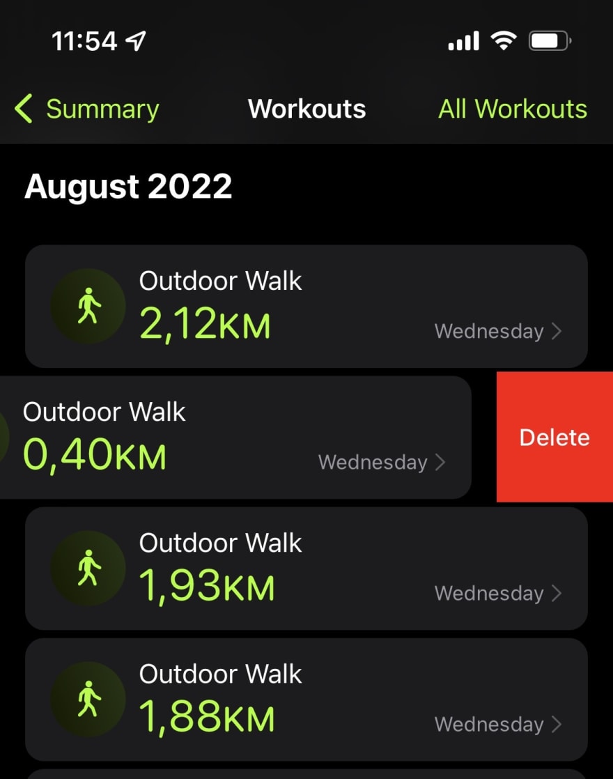
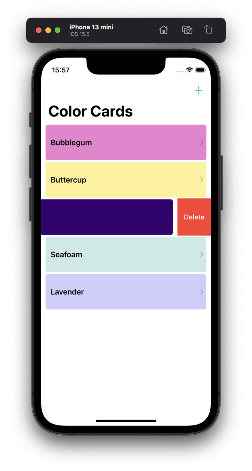
I love the way Apple’s Health and Fitness apps presents CardViews: in a List with a gap between the cards and a swipe left to delete. This seem to be a desired design between iOS developers.

This playground is a simple example on how to recreate the same effect with SwiftUI since all the examples I found online implements the same design in a much more complex manner.

We’ll take the Apple’s Dev Training “Creating a card view” as an inspiration and starting point.
Data Model
First lets create the Data Model for our CardView. It’s a simple model holding a Theme to color our CardViews.
import Foundation

struct ColorCard: Identifiable {
    let id = UUID()
    var theme: Theme
}
Card View
The CardView has the following structure.
import SwiftUI

struct CardView: View {
    let colorCard: ColorCard

    var body: some View {
        Text(colorCard.theme.name)
            .foregroundColor(colorCard.theme.accentColor)
            .font(.headline)
            .padding(
                EdgeInsets(
                    top: 25,
                    leading: 5,
                    bottom: 25,
                    trailing: 5
                )
            )
    }
}
Content View
And finally our ContentView containing the List of CardViews. To create the gap between the List items we remove the list row separators .listRowSeparator(.hidden) and set the list row background to an InsettableShape .listRowBackground() defining a top and a bottom EdgeInsets padding. The final touch is to set the .listStyle(.plain) to .plain.
import SwiftUI

struct ContentView: View {
    @State private var colorCards: [ColorCard] = ColorCard.sampleData

    var body: some View {
        List {
            ForEach(colorCards) { colorCard in
                NavigationLink(destination: colorCard.theme.mainColor) {
                    CardView(colorCard: colorCard)
                }
                .listRowSeparator(.hidden)
                .listRowBackground(
                    RoundedRectangle(cornerRadius: 5)
                        .background(.clear)
                        .foregroundColor(colorCard.theme.mainColor)
                        .padding(
                            EdgeInsets(
                                top: 2,
                                leading: 10,
                                bottom: 2,
                                trailing: 10
                            )
                        )
                )
            }
            .onDelete { idx in
                colorCards.remove(atOffsets: idx)
            }
        }
        .listStyle(.plain)
        .navigationTitle("Color Cards")
        .toolbar {
            Button {
                colorCards.append(ColorCard(theme: Theme.allCases.randomElement()!))
            } label: {
                Image(systemName: "plus")
            }
        }
    }
}
A complete Playground App is available on github reposity SwiftUI List CardView Example.
